Overview
Segmented controls are UI elements that allow users to make exclusive selections from a set of options, often displayed as distinct segments or buttons. They are effective for organizing and presenting choices, such as filtering content or switching between views, in a visually intuitive manner. Segment controls enhance user navigation and decision-making within an application.
Usage
<modus:TMSegmentedControl x:Name="SegmentedItemSegmentControl"
                          Size="{Binding Size}"
                          IsRounded="{Binding RoundedCorners}"
                          ColorTheme="{Binding SegmentTheme}"
                          IsEnabled="{Binding IsEnabled}"
                          ItemsSource="{Binding SegmentedItemItems}" />
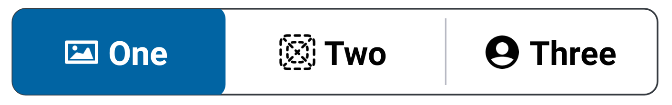
Output
Properties
| Property | type | Description |
|---|---|---|
| Size | SegmentedControlSize
| Size of the chip |
| ColorTheme | SegmentColorTheme
| Changes the fill color of the chip (Default is Fill) |
| IsRounded | bool
| Set this to Error if you want the chip to be themed in red |
| IsEnabled | bool
| Input type chip will have a close icon in the right |
| ItemsSource | IEnumerable
| List of segment items to be displayed |
| SelectedIndexChanged | EventHandler<SelectedIndexEventArgs>
| Called when the a segment item is tapped |
| SelectedIndexChangedCommand | ICommand
| Called when the a segment item is tapped |