Overview
A radio button is a graphical user interface element to allow users to make a single selection from a list of options, unlike checkboxes enable users to select multiple options independently. Radio buttons are often used when users need to choose a single option from a set of mutually exclusive choices.
Usage
<modus:TMRadioButtonGroup x:Name="RadioGroup"
SelectedIndex="0"
Orientation="Vertical"
SelectedRadioButtonChanged="OnSelectedRadioButtonChanged"
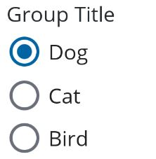
GroupTitle="Group Title">
<modus:TMRadioButton Text="Dog"
IsEnabled="True"
IsSelected="True"/>
<modus:TMRadioButton Text="Cat"
IsEnabled="True"
IsSelected="False"/>
<modus:TMRadioButton Text="Bird"
IsEnabled="True"
IsSelected="False"/>
</modus:TMRadioButtonGroup>
Output
Properties
| Property | type | Description |
|---|---|---|
| Text | string
| Title of the Radio Button |
| IsEnabled | bool
| When set to True it enables user interaction |
| IsSelected | bool
| When set to True it the Radio Button is in selected state |
| SelectedIndex | int
| The default index value of the Radio Button Group |
| Orientation | StackOrientation
| Defines how the Radio Button Group’s orientation will be set either Vertical or Horizontal. Default is Horizontal |
| SelectedRadioButtonChanged | EventHandler<TMRadioButtonEventArgs>
| Called when a RadioButton is tapped |
| SelectedRadioButtonChangedCommand | ICommand
| Called when a RadioButton is tapped |