Overview
Lists are fundamental UI components used to present information in a structured and easily scannable format, making content more accessible. They can be used for a variety of purposes, including displaying menu items, organizing data, or presenting sequential steps in a user interface.
Usage
<modus:TMListView x:Name="textCellList"
                  IsVisible="True"
                  SelectionMode="{Binding SelectionMode}"
                  SelectionChangedCommand="{Binding ItemSelectedCommand}"
                  ItemsSource="{Binding ItemSource}">
  <modus:TMListView.ItemTemplate>
    <DataTemplate x:Name="TextCell">
       <modus:TextCell
         Title="{Binding Name}"
         Description="{Binding Address}"
         LeftIconSource="{Binding ProfilePic}"
         RightIconSource="{Binding ProfilePic}">
       </modus:TextCell>
     </DataTemplate>
  </modus:TMListView.ItemTemplate>
</modus:TMListView>
Output
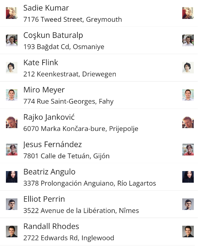
View cells of Data Templates
There are two type of view cells Text cell and a template cell which can have any set of components inside it.
Text Cell Properties
| Property | type | Description |
|---|---|---|
| Title | string
| Title of the list item |
| Description | string
| Description of the list item |
| LeftIconSource | ImageSource
| Image Source of that left icon |
| RightIconSource | ImageSource
| Image Source of that right icon |
Properties
| Property | type | Description |
|---|---|---|
| SelectionMode | ListSelectionMode
| Sets selection mode to either None,Single,Multiple. |
| SelectionChangedCommand | ICommand
| Called when a list item is tapped |
| SelectionChanged | EventHandler<SelectionChangedEventArgs>
| Called when a list item is tapped |
| ItemsSource | IEnumerable
| List of list items to be displayed |
| SelectableItems | List<object>
| List of list items selected |