Overview
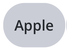
Chips represent a complex piece of information in a compact form, such as an entity (person, place, or thing) or text. They allow users to enter information, make selections, filter content, or trigger actions. Unlike buttons, chips should appear dynamically as a group of multiple interactive elements.
Usage
<modus:TMChips Title="Apple"
                ChipSize="Default"
                ChipType="Filter"
                ClickedCommand="{Binding ClickChipCommand}" />
Output

Chip Type
Chip type can be changed into Input which will show a close icon which the user can use to remove the chip from the view

Image in Chip
You can also add a icon to the chip which will be displayed near the title of the chip. Note that the icon will be displayed only for the Input type Chip
Properties
| Property | type | Description |
|---|---|---|
| Title | string
| Title of the chip |
| ChipSize | ChipSize
| Size of the chip |
| ChipState | ChipState
| Set this to Error if you want the chip to be themed in red |
| ChipStyle | ChipStyle
| Changes the fill color of the chip (Default is Fill) |
| ChipType | ChipType
| Input type chip will have a close icon in the right |
| CloseCommand | ICommand
| Called when the close icon is tapped (Applicable only for the input type chip) |
| ClickedCommand | ICommand
| Called when the chip is tapped |