Overview
Checkboxes should be used in forms that require submission and processing. The checkbox is shown as a square box that is ticked when it is activated. It allows the user to select one or more options among all the limited choices and requires a button press to confirm the user’s settings before they are committed.
Modus Checkboxes Documentation
Usage
<Modus:TMCheckBox x:Name="ChildCheckBox1"
                IsDisabled="False"
                IsChecked="True"
                Text="Accept Terms"
                Size="Default" />
Output

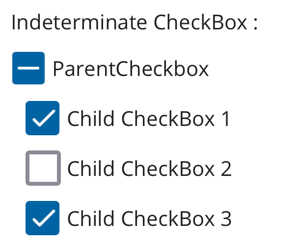
Indeterminate Checkbox
The checkbox can have a tick mark or a blank space in the box. But when the Indeterminate property is set to True, it shows a minus(-) icon in the box

You can use this property when you show a group of checkboxes along with a parent checkbox.

Properties
| Property | type | Description |
|---|---|---|
| Text | string
| Title of the checkbox |
| Size | CheckboxSize
| Defines the size of the checkbox |
| IsChecked | bool
| Shows if the checkbox is checked or not |
| IsIndeterminate | bool
| Display a minus icon in the box. To be used when along with child checkboxes |