Overview
Cards act as containers or surface for displaying relevant grouped information. Cards can be used as a single entity or in lists or grids for browsing and are often interactive. Cards can contain a wide range of both static and interactive content. They should not be nested within other cards and cannot divide into multiple cards. The card container is the only required element in a card.
Usage
<Modus:TMCard x:Name="card2"
                    Command="{Binding Command}"
                    CommandParameter="Parameter">
        <!--Custom Content-->
        <!--Basically you can have anything you want here-->
</Modus:TMCard>
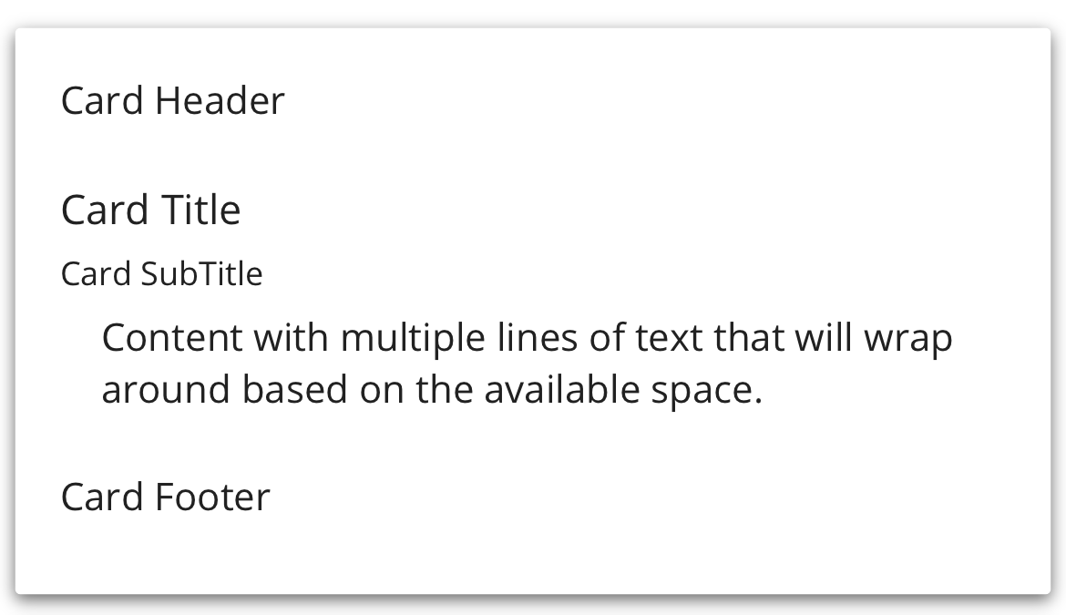
For example, the following code will produce the following output in the UI
<Modus:TMCard x:Name="card2"
                    Command="{Binding Command}"
                    CommandParameter="Parameter">
        <StackLayout>
          <!-- Header -->
          <StackLayout BackgroundColor="Transparent"
                       Padding="0,0,0,10">
            <Label Text="Card Header"
                   HorizontalOptions="Start"
                   VerticalOptions="Center" />
          </StackLayout>

          <!-- Content -->
          <StackLayout BackgroundColor="Transparent"
                       Padding="0,10,0,10">
            <Label Text="Card Title"
                   FontAttributes="Bold"
                   FontSize="15" />
            <Label Text="Card SubTitle"
                   FontAttributes="Bold"
                   FontSize="12"
                   Padding="0,5,0,5" />
            <Label Text="Content with multiple lines of text that will wrap around based on the available space."
                   HorizontalOptions="Center"
                   VerticalOptions="Center"
                   LineBreakMode="WordWrap" />
          </StackLayout>

          <!-- Footer -->
          <StackLayout BackgroundColor="Transparent"
                       HorizontalOptions="End"
                       Padding="0,10,0,10">
            <local:TMButton Text="Button"></local:TMButton>
          </StackLayout>
        </StackLayout>
</Modus:TMCard>
Output
Properties
| Property | type | Description |
|---|---|---|
| IsSelected | bool | When set to True, the Card will be highlighted in light bluecolor
|
| Command | ICommand | Defines the command to be executed when the Card is tapped |
| CommandParameter | object | Specifies the parameter for the Command |