Overview
Buttons express what action will occur when the user clicks or touches it. Buttons are used to initialize an action, either in the background or foreground of an experience.
Usage
Creating the simple primary button
<modus:TMButton Text="Click Me!"
                LeftIconSource="email.png"
                Clicked="TMButton_Clicked" />
Sizing
Buttons support 4 different sizes
<modus:TMButton Text="XSmall (32px)"
                Size="XSmall" />

<modus:TMButton Text="Small (40px)"
                Size="Small" />

<modus:TMButton Text="Default (48px)"
                Size="Default" />

<modus:TMButton Text="Large (56px)"
                Size="Large" />
Icons
Buttons can have icon either on the right or left or both
<modus:TMButton Text="Click Me!"
                LeftIconSource="arrow_left.png"
                RightIconSource="arrow_right.png" />
Color
Based on the functionality of the button, it can have 4 different colors. Primary is the default
<modus:TMButton Text="Primary"
                ButtonColor="Primary" />
<modus:TMButton Text="Secondary"
                ButtonColor="Secondary" />
<modus:TMButton Text="Tertiary"
                ButtonColor="Tertiary" />
<modus:TMButton Text="Danger"
                ButtonColor="Danger" />
Styles
3 different styles are available to use
- Fill (Default) - Available in all colors
- Outline - Only available in Primary and Secondary colors
- Borderless - Only available in the Primary
<Modus:TMButton Margin="10,5"
            Text="Outline Primary"
            ButtonStyle="Outline"
            ButtonColor="Primary" />
<Modus:TMButton Margin="10,5"
            Text="Outline Secondary"
            ButtonStyle="Outline"
            ButtonColor="Secondary" />
<Modus:TMButton Margin="10,5"
            Text="Borderless Primary" />
Command and Event Handler
Like all the buttons, the TMButton has Command, CommandParameter and the EventHandler also
<Modus:TMButton Text="Increase Count"
                Clicked="OnCounterClicked"
                Command="{Binding IncreaseCountCommand}"/>
Screenshot
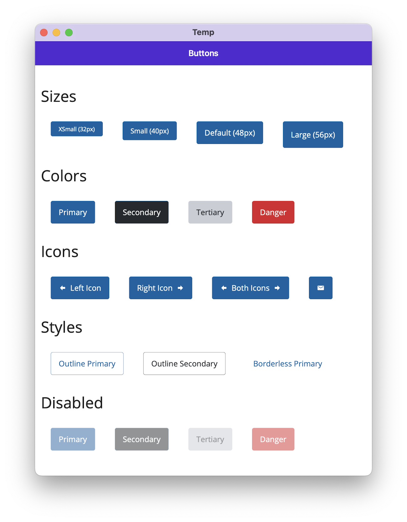
Notes
- Outline buttons only support ‘primary’ and ‘secondary’ colors.
- Borderless buttons only support a single color.