Overview
Bottom navigation bar allows movement between primary destinations in an app. It is fixed to the bottom of screens for convenient access. Each destination should be represented by an icon, ideally with a label.
Modus Bottom Navbars Documentation
Usage
<modus:TMTabbedPage xmlns="http://schemas.microsoft.com/dotnet/2021/maui"
xmlns:x="http://schemas.microsoft.com/winfx/2009/xaml"
xmlns:modus="clr-namespace:Trimble.Modus.Components;assembly=Trimble.Modus.Components"
xmlns:local="clr-namespace:DemoApp"
TabColor="Primary"
Orientation="Vertical"
xmlns:tabs="clr-namespace:DemoApp.Views.TabViewItems"
xmlns:constants="clr-namespace:DemoApp.Constant"
x:Class="DemoApp.Views.TabbedPageDemo">
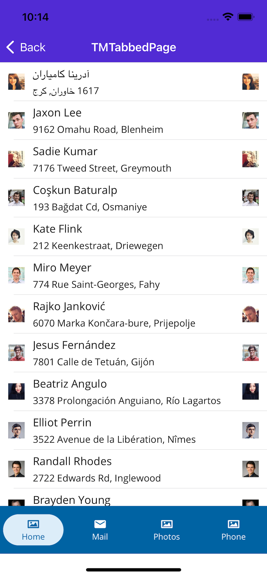
<modus:TabViewItem Text="Home"
Icon="{Static constants:ImageConstants.DarkGalleryIcon }">
<tabs:TabViewOne />
</modus:TabViewItem>
<modus:TabViewItem Text="Mail"
Icon="{Static constants:ImageConstants.Email }">
<tabs:TabViewTwo />
</modus:TabViewItem>
<modus:TabViewItem Text="Photos"
Icon="{Static constants:ImageConstants.DarkGalleryIcon }">
<tabs:TabViewThree />
</modus:TabViewItem>
<modus:TabViewItem Text="Phone"
Icon="{Static constants:ImageConstants.DarkGalleryIcon }">
<tabs:TabViewFour />
</modus:TabViewItem>
</modus:TMTabbedPage>
The above code will produce the following code
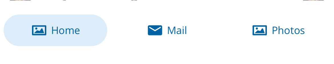
Tab Orientation
By default, the icon and the text of the nav bar are aligned vertically. You can change the orientation to horizontally

Tab Color
The bottom nav bar supports two different theme too
Properties
| Property | type | Description |
|---|---|---|
| Orientation | StackOrientation
| Defines how the text and the icon are arranged in the tab item. Default is Vertical |
| TabItemsSource | IList
| List of tab items to be displayed |
| SelectedIndex | int
| Defines which tab item is selected or need to be selected |
| TabColor | TabColor
| Changes the background and text color of the bar item. Default is dark blue (Primary) |
Note
Currently the modus bottom nav bar accept only ContentView as its child