Overview
Accordions are containers that expand to reveal content progressively to limit the amount of information on the page or in a section to reduce clutter. The content can be expanded and collapsed based on the user’s interest.
Usage
Unlike the MAUI’s default Expander control, the Modus accordion doesn’t have the header property. It has a default header property which has a title and a subtitle. You can have anything in those fields
The accordion will accept any layout/control as its child which that will get revealed when the header is interacted with it (clicked or tapped)
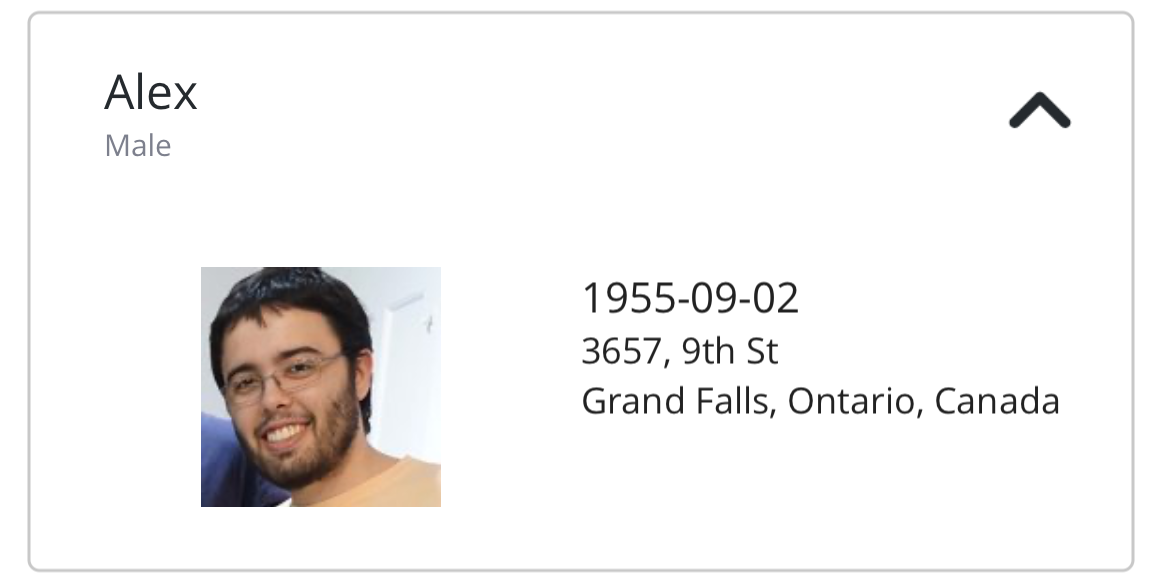
<modus:TMAccordion AccordionTitle="Alex"
                   AccordionSubtitle="Male"
                   ChevronPosition="Right"
                   Size="Large">
  <Grid RowSpacing="10"
                Padding="10">
    <Grid.ColumnDefinitions>
      <ColumnDefinition Width="*" />
      <ColumnDefinition Width="*" />
    </Grid.ColumnDefinitions>
    <Image Grid.Column="0"
                    Source="https://randomuser.me/api/portraits/men/37.jpg"
                    Margin="10,0,10,0"
                    VerticalOptions="Center"
                    HorizontalOptions="Center"
                    HeightRequest="80"
                    WidthRequest="80" />
    <StackLayout Orientation="Vertical"
                          Grid.Column="1">
      <Label Text="1955-09-02"
                      FontSize="Small" />
      <Label Text="3657, 9th St"
                      FontSize="Micro" />
      <Label Text="Grand Falls, Ontario, Canada"
                      FontSize="Micro" />
    </StackLayout>
  </Grid>
</modus:TMAccordion>
Output
Collapsed

Expanded

Properties
| Property | type | Description |
|---|---|---|
| Size | AccordionSize | The header size of the accordion. |
| ChevronPosition | AccordionChevronPosition | Defines where the chevron needs to be placed. Default is Right
|
| LeftIconSource | ImageSource | When provided, this image will be displayed in the left of the header (optional) |
| RightIconSource | ImageSource | When provided, this image will be displayed in the right of the header(optional) |
| Content | IView | Defines the content to be revealed when the Accordion expands. |
| AccordionTitle | string | Title of the header. Required |
| AccordionSubtitle | string | Displayed below the title in the header. Optional |
| IsOpen | bool | Determines if the Accordion is expanded. |
Warning
Accordion doesn’t work well when used in the ListView